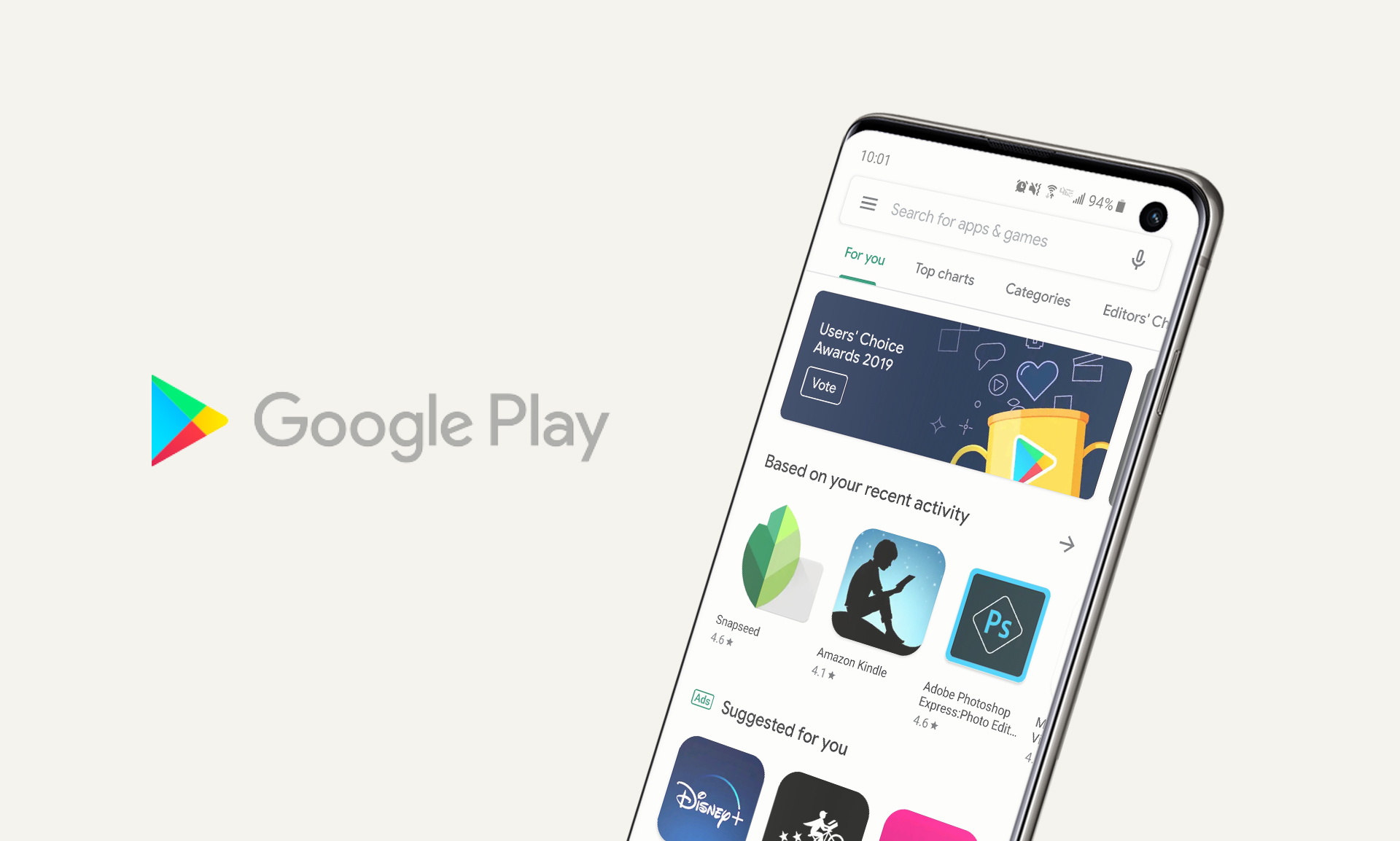
Google Play Store
Product deconstruct — 2019
Product deconstruct — 2019
Intro
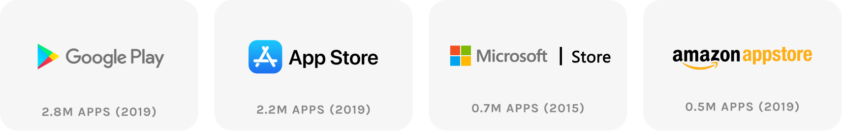
There are many ways people discover apps. People on iOS are given the App Store app by default, and Android the Google Play Store. Ads on social media are also a common way to see new apps.
This exercise focuses on the Google Play Store browsing experience.
Entry
Upon opening Google Play there are a few screens you can land on:
The app will always open up on the tab you left off. It’s hardly noticeable but, in theory, defaults to the tab you use most as the home for convenience.
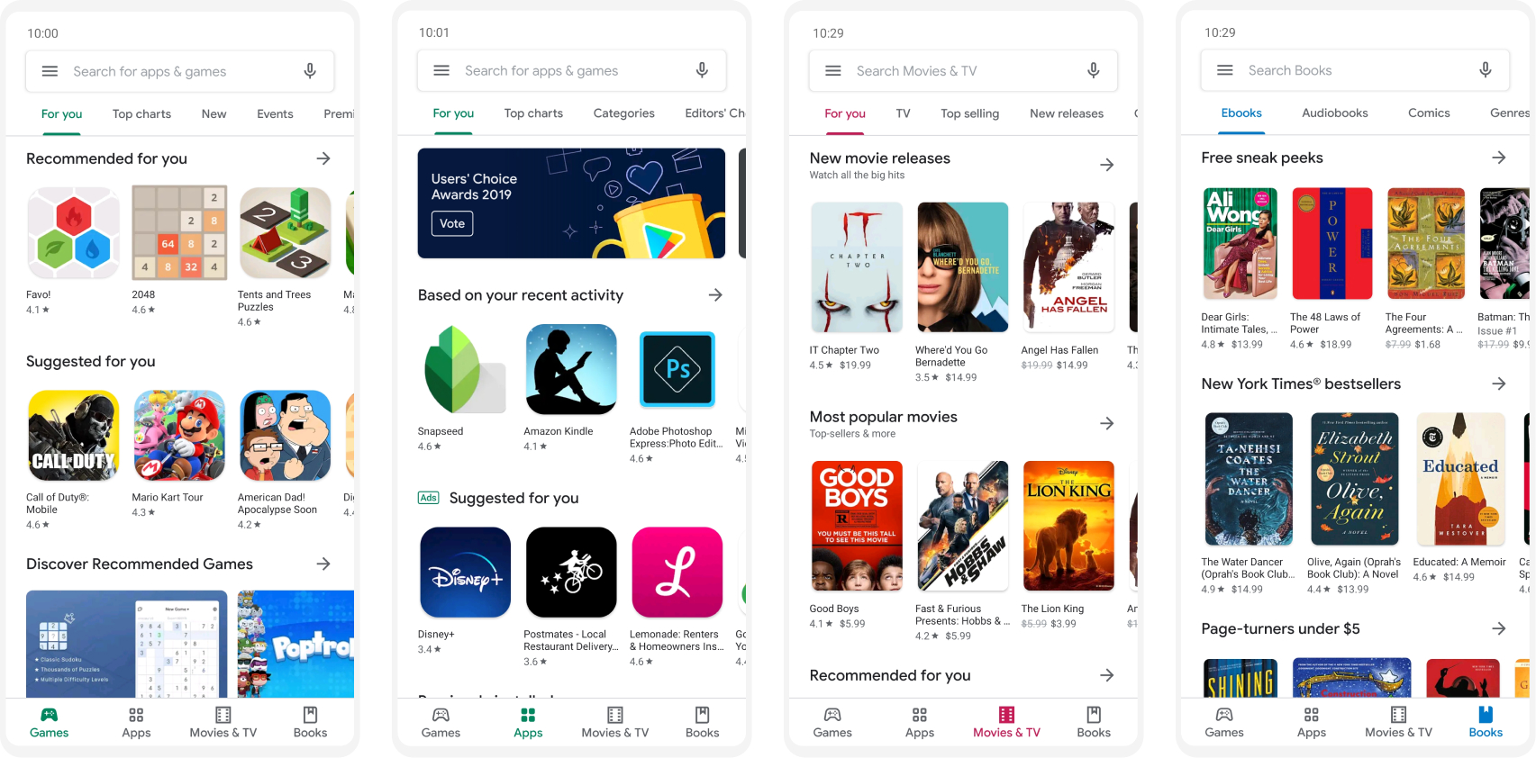
The four tabs are the first filtering of the overall browsing experience. Though Games are a subset of Apps, it makes sense to split out Games as a bucket since they drive so much revenue. According to a Business of Apps report, “mobile games account for 77% of total 2018 app revenue.”
Each main tab has its own set of sub-tabs at the top, starting with For you across the board. I’m assuming the Books tab doesn’t have a For you section as I haven’t purchased any books on the Google Play Store before. So, there isn’t any history for the store to create this content.
Choose your browsing style
There are four main ways to browse within the overarching Apps tab.
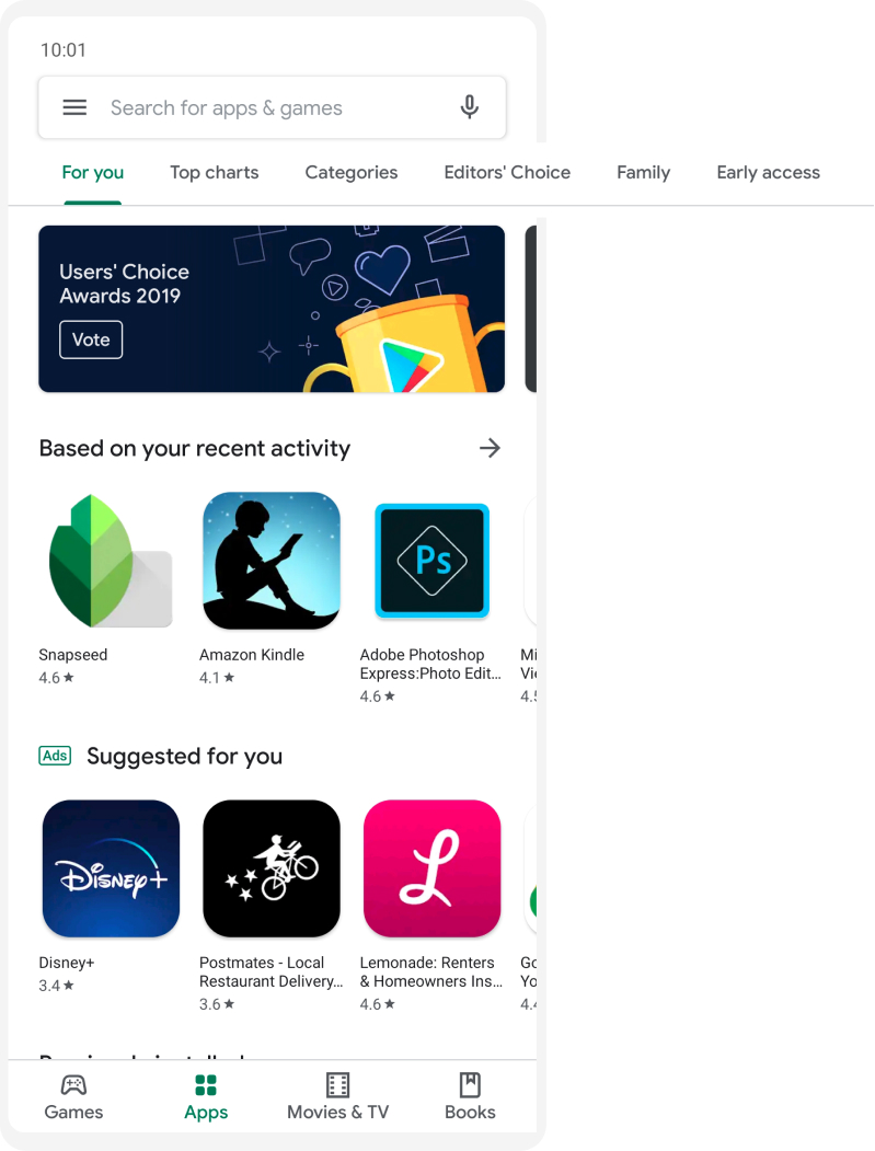
1. Personalized suggestions
For you
Recommended apps you don’t have installed but may enjoy based on your past download history.
2. Social proof
Top charts, Editors' Choice
Apps backed by social proof. Quantitatively supported by number of downloads in Top charts, and qualitatively supported by curation in Editors’ Choice.
3. Filter by intent
Family, Early access
For people looking to browse all apps that fit a certain filter: I want to download family-friendly apps for children. Or, I want to download apps that are new and may even still be in development. Family is more robust, but both options offer more filters to further narrow browsing.
4. Search
Search is another experience in itself, crucial to the overall browsing experience. People can search for specific apps if they want to find something specific that they already know about.
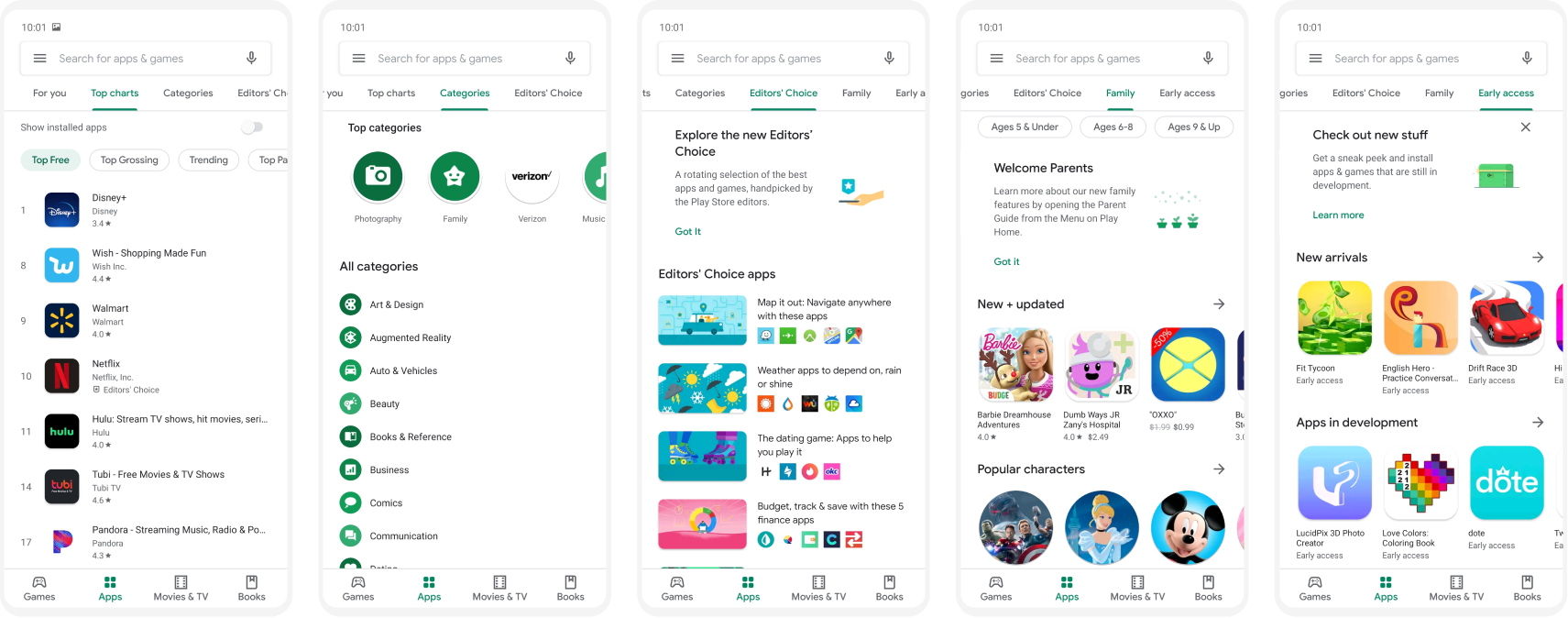
Overall sub-tab layout and design
Each sub-tab has a different layout. Though these are all designed differently based on the content and purpose within each sub-tab, they end up feeling chaotic when switching between them.
A few inconsistencies:
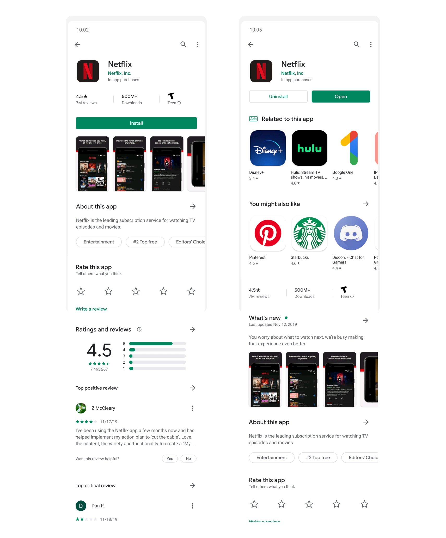
Viewing an app
When viewing an app, the layout differs depending on if you have it installed or not.
Apps you don’t have installed focus on highlighting the product. Whereas apps already installed prioritize ads and recommend other apps before telling you more information about the app you’re on. While this may encourage more downloads, the UX is disingenuine for apps already installed. For people browsing it's harder to see information about the app tapped on. And for developers, content is deprioritized for the benefit of Google's ads.
Summary
Overall the underlying structure of the Google Play Store makes a lot of sense. It’s pretty easy to browse based on how you want to browse. But it does get messy and could benefit from more consistency.