Caviar app
Product deconstruct — 2019
Product deconstruct — 2019
Intro
The meal delivery industry has become a staple of life for many Americans, whether you’re getting food delivered or delivering it.
There are a handful of major players in the food delivery space. This deep dive focuses on Caviar.
Entry
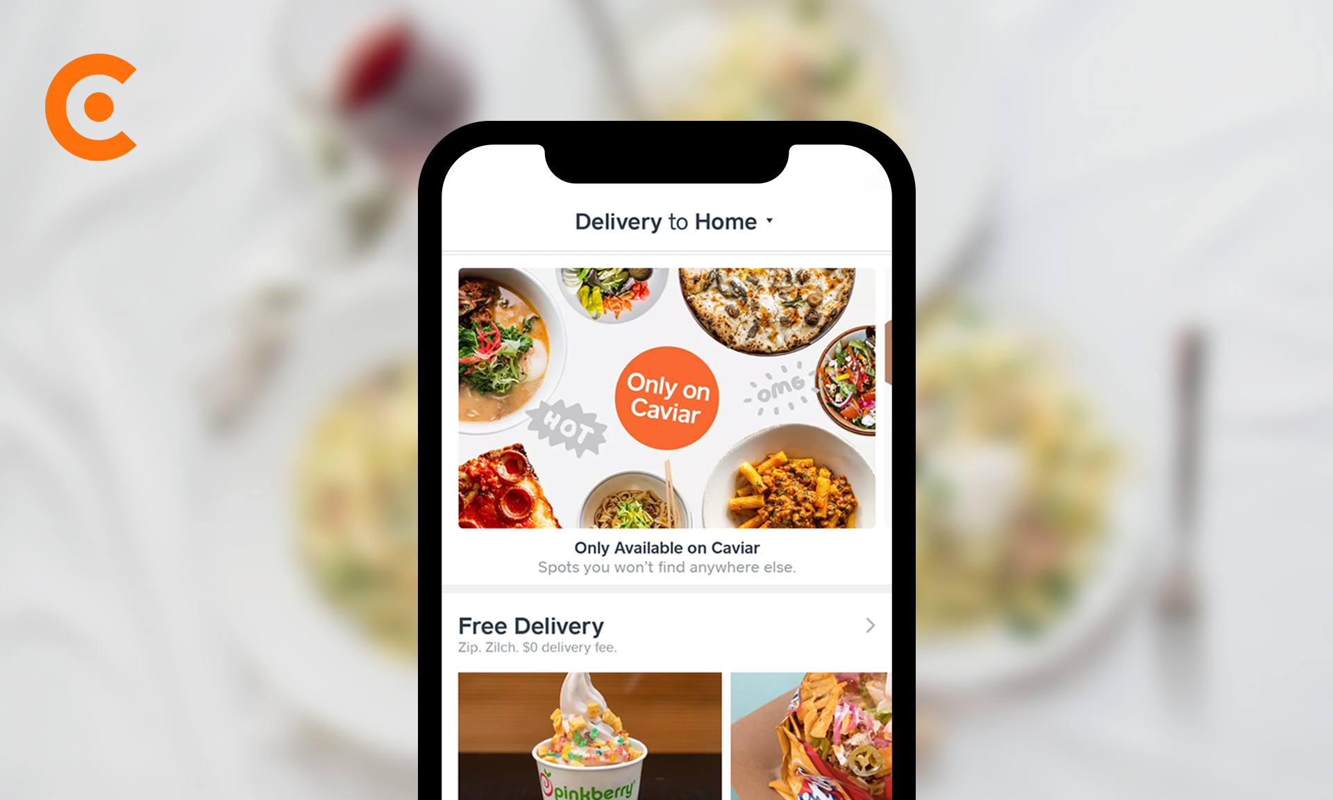
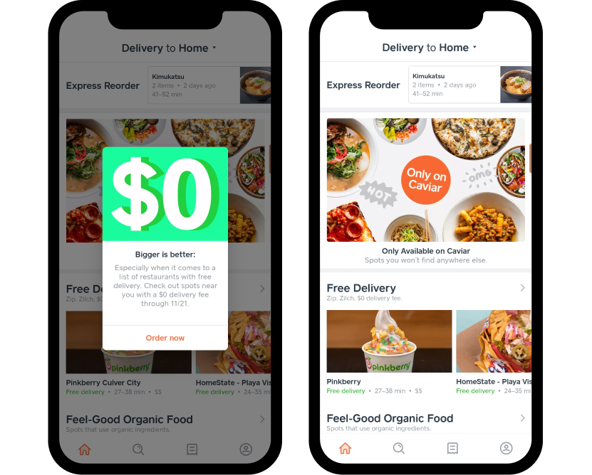
The first thing seen upon opening the app is often a promotional modal.
There is no UI indicating how to close it. People can choose to either try and tap outside to refuse the promotion or tap to continue. An approach in more engagement and taps to “Order now,” although it feels forced.
After tapping out of the modal, you see your home screen. The actions you can take (without scrolling) from top to bottom:
1. Edit Delivery Location
Editing delivery location is pretty critical as everything beneath it will change depending on what’s in your area.
2. Express Reorder
The ability to quickly reorder a previous delivery is a convenient quick action. This convenience seems like it would help increase the recurring engagement of customers.
3. Browse Only on Caviar
Promoting what makes Caviar different has two benefits. It makes it easier for people who come to Caviar for specific restaurants while also making the experience feel more exclusive.
4. Browse Free Delivery
Free delivery is an enticing perk to promote above the fold. A free delivery may encourage people to order their first delivery ("Hey, why not. It's free."), and increase the chances of someone sticking around regardless of the delivery fee.
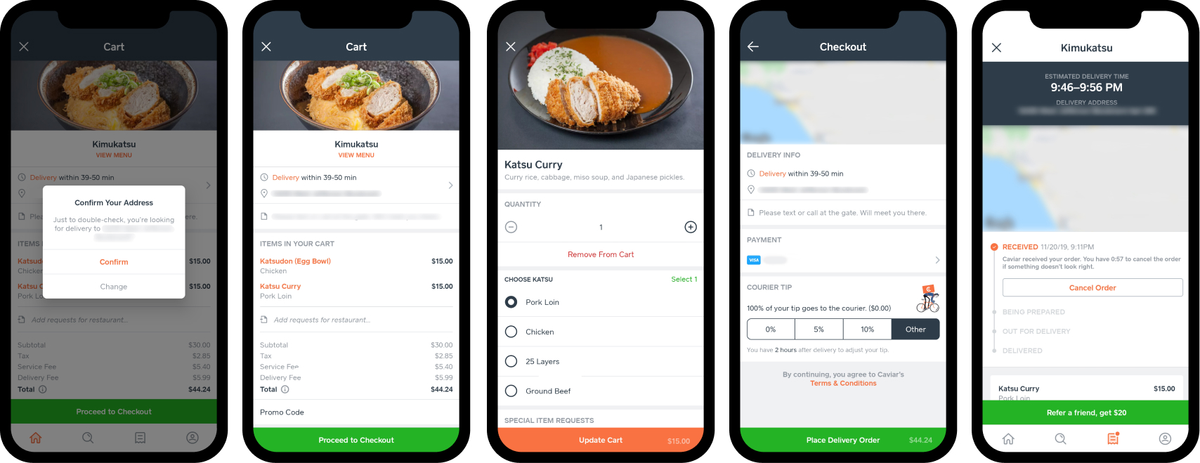
Express Reorder
This flow is short and consists of the steps below:
1. Confirm Your Address
When you tap to reorder a previous delivery, the app prompts you to confirm your delivery location. Since the flow is short, this explicitly reconfirms information early on to avoid mistakes. As it's easy to miss for people who commonly order to multiple addresses (eg. office, home, friends place, etc.).
2. Cart
Upon confirmation, you can review your order or proceed to check out. Tapping on an item on this screen allows you to edit the order. If you want to remove an item, the first button available to complete the action is to change the quantity to 0. However, this functionality is not supported. You must tap "Remove From Cart" to remove it.
This UX is confusing. Compared to the item names on the previous screen, "Remove From Cart" is a similar color and position. So rather than the color highlighting the action, it's hidden when going between the two screens — making it easy to gloss over. Either differentiating the "Remove From Cart" button or adding the ability to change the quantity to 0 may help.
3.Checkout
This layout stays consistent with the previous screens. You can see a receipt before officially submitting your order. Upon submission, you can see the status of your order. Being able to cancel from this screen is handy and likely reduces the number of support conversations needed.
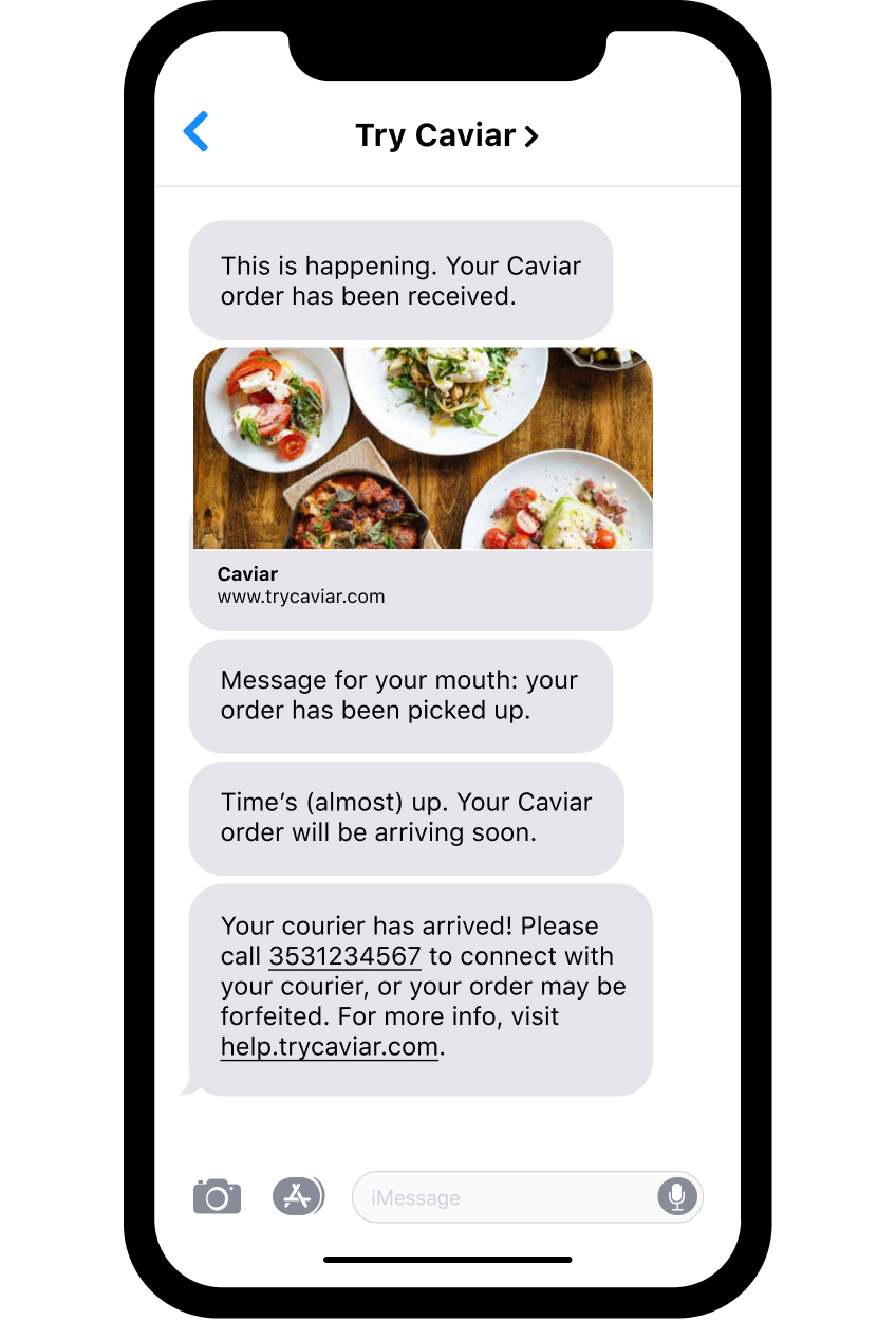
Tracking order status
After submitting an order, you can track its progress in the app. Status text updates extend the Cavier experience outside of the app.
Most of the messages are helpful, but for a short time, Caviar sent this message:
“Your courier has arrived! 🙌 Please call 3531234567 to connect with your courier, or your order may be forfeited. For more info, visit help.trycaviar.com”
This text shatters the experience because it implies that:
Caviar has since removed this message. Which, is a good move due to the passive-aggressive and overall unhelpful tone.
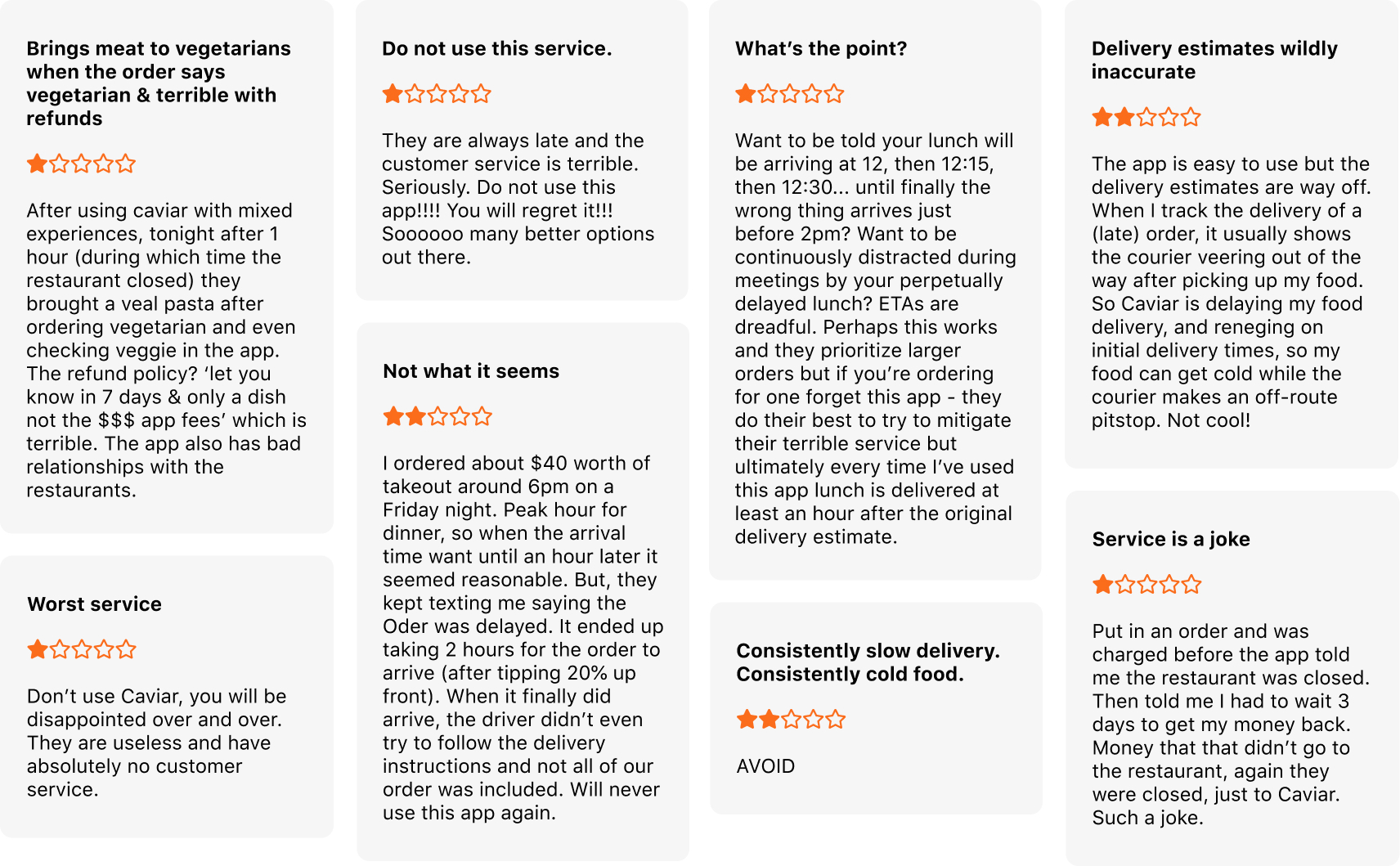
Delivery times
Based on reviews the areas with room for improvement are more accurate delivery time predictions, a better delivery experience, and improved customer support quality.
These seem like problems exacerbated by the strains of company and user growth. Looking at the reviews for Postmates and Uber Eats (both with a 4.8 rating on iOS), they both suffer from the same issues. Although, these things are all related.
1. Predicting delivery times
Delivery times are probably a combination of how long it takes to:
There are many ways to approach this (algorithms, human predictions from restaurant staff, or a mix of the two). Padding predictions would enhance the experience to feel like your delivery came early. On the flip side, a two-hour delivery estimate is also a turn-off. The delivery times may be intentionally optimistic for an optimized number of orders submitted, with the trade-off being a poor end experience (late delivery). That said, delivery prediction times are likely an ongoing adjustment.
2. Better delivery experience
The delivery experience ultimately relies on fast delivery times. Although, there are some operational challenges around restaurants not being to respond to orders fast enough and couriers putting in minimal effort to ensure they hand off deliveries to the right person.
From a user perspective, it would make sense to have two ratings — the quality of service from the restaurant (food prep time, order correctness) and the quality of service based on the courier (the work put in to deliver well).
There's room for exploration here as many popular delivery services struggle with this. The solution is likely radically different from the current model.
3. Customer support
People often go to customer support when they have a poor experience. Improving delivery time predictions and the delivery experience would resolve the majority of the existing complaints. To improve the customer support experience itself, enforcing a more empathetic tone would likely go a long way.
Summary
The Caviar app is pretty easy to use. The UX is proactive about potential problems and the design is consistent. A weak delivery experience is not unique to Caviar. Delivery experience is arguably the hardest area to solve as it relies heavily on human operations.